The Need for Player Feedback

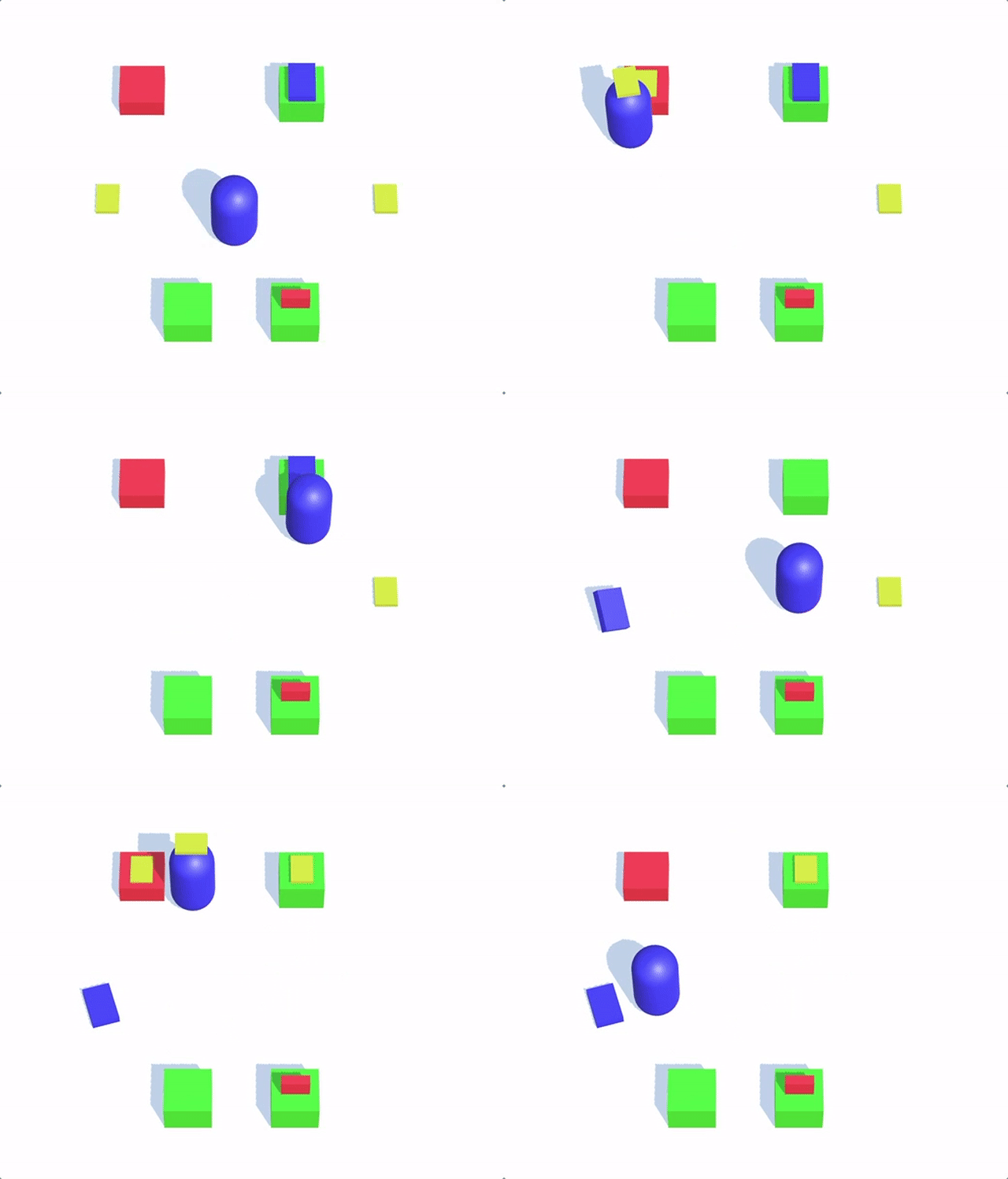
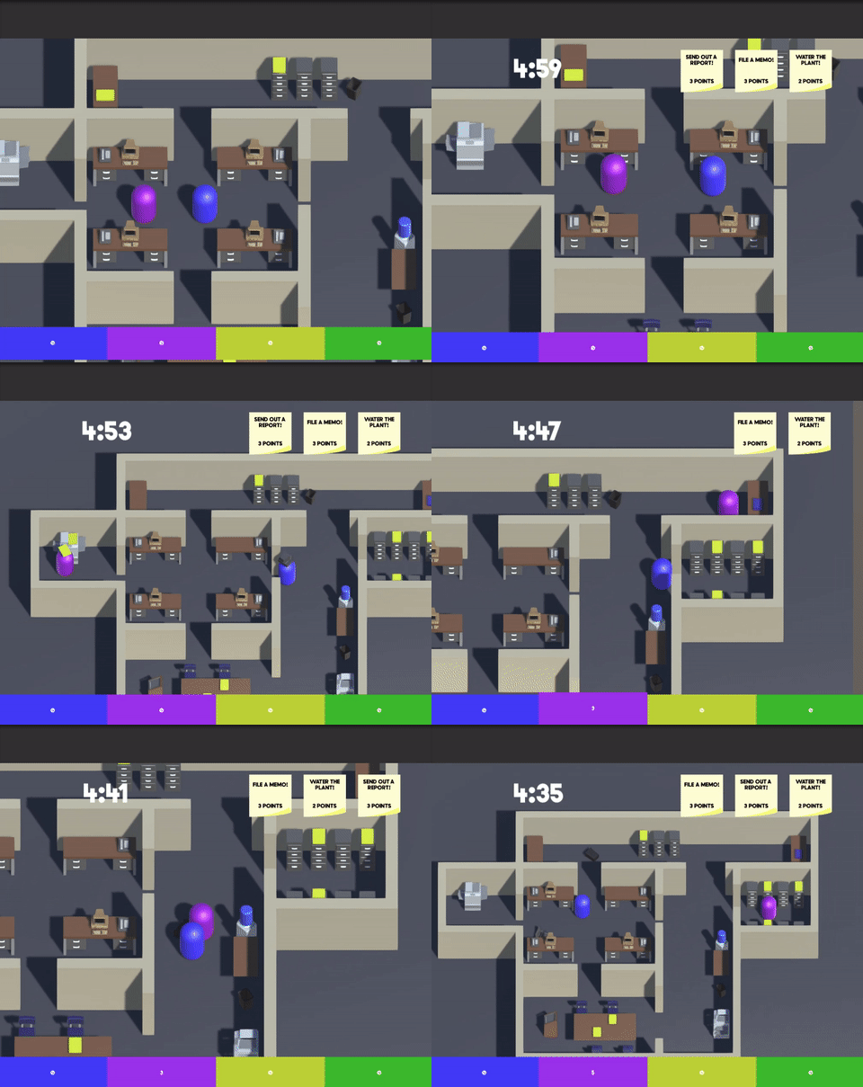
It’s been about two weeks since I last talked about Capstone, and a lot has been going on! That right there is the last gif I showed you, which was nothing more than a technical demo while I was laying down the foundations of the systems. Since then, we’ve added throwing and boost mechanics, implemented art, levels, and the basic game loop to have a much more complete - and easily tested - prototype. One recurring piece of feedback we get from QA, though, is the apparent lack of player feedback, and this is usually coupled from people who have only seen our game and not played it with ‘well, it doesn’t LOOK like mayhem!’ This has been a tough pill to swallow, but we are chipping away at it.

Before I dive into the main meat of this post, a quick recap of the last two weeks is in order. We successfully challenged Deep Dive and are currently in Proof of Concept (with the goal of challenging on November 3rd). We’ve attended multiple QA sessions, and are trying to attend as many more as we can. Our mantra behind this is that we want the player’s feedback to drive the direction of the game based on empirical evidence, not just ideas that we think will work or things we would like to see. For instance, after receiving feedback that we want to make sure the individual interactions don’t feel boring, our collective minds went straight to complicated, life-like interactions (like moving the right stick to use the water cooler, or having a DDR-like sequence for sending emails), but after bringing this question to QA, we quickly found out that it would add variety, but also another level of memorization, and detract the players’ focus on each other and sabotaging the office. Reasons like these are why we are trying to attend as many QA sessions as possible. Other areas that have been improved thanks to QA feedback: more open level design, with faster player movement to add to the sense of mayhem, faster, less-floaty throwing of objects, different boost implementation and better desk-snapping (did I mention that thrown objects will automatically snap to the correct place if they land on desks?). Items like these would have not been addressed on our own accord, and we are really proud for how complete our prototype is feeling. Sure, we don’t have interruptibles implemented, or half of our tasks, but the core experience is there and people really seem to enjoy it. We’ve had multiple testers come to us and say this was their favorite game they’ve played this semester, and we’ve even had other seniors tell us how much they’d like to work on the project if their’s gets cut! Little things like these make the team that much more determined to push through.

Back to the topic of the post: player feedback, a consistent quip. For us, and probably the reason why we’ve shown so little progress, there’s a fine balance between showing mayhem, and just being a busy screen where no one understands the game. We’ve been questioned about why our environment and art assets are so clean-looking: we want items to be instantly recognizable, and have a Lego-like look and feel to them that adds to the playful, not-quite-real-life qualities of the game. Yeah, when someone throws a computer, the keyboard magically stays attached, and players can create copies of outboxes, but we want that off-handed absurdness to remind players that this isn’t real life, and they’re free to do what they want. We agree that there can be a lot more player feedback to further add to the sense of pandemonium – sound effects, progress bars shattering, confetti and particles – but we want to really explore and experiment to just barely push the line of too much; we want to do this tactfully. A lot of it, too, will come down to polish and implementing some of our subsystems: like being able to throw items out windows, and then come back up the elevator, and being chucked across the level or the copier shooting out items at a million miles per hour. We’ve already addressed players’ issues of not knowing when a task is completed, and this ‘mayhem conundrum’ is our next priority. With the clock winding down though (there’s only three and a half weeks until final presentations), and so much else we need to get done, this ‘visual sense of mayhem’ may need to come in another form outside of the prototype. Whether this be a trailer, poster, renders, or some other form, I do not know. Regardless, we’re going to make sure it is the best it can be.
As always, check out Jeremy’s, Will’s, and Richard’s blogs for more insight into Office Mayhem!
