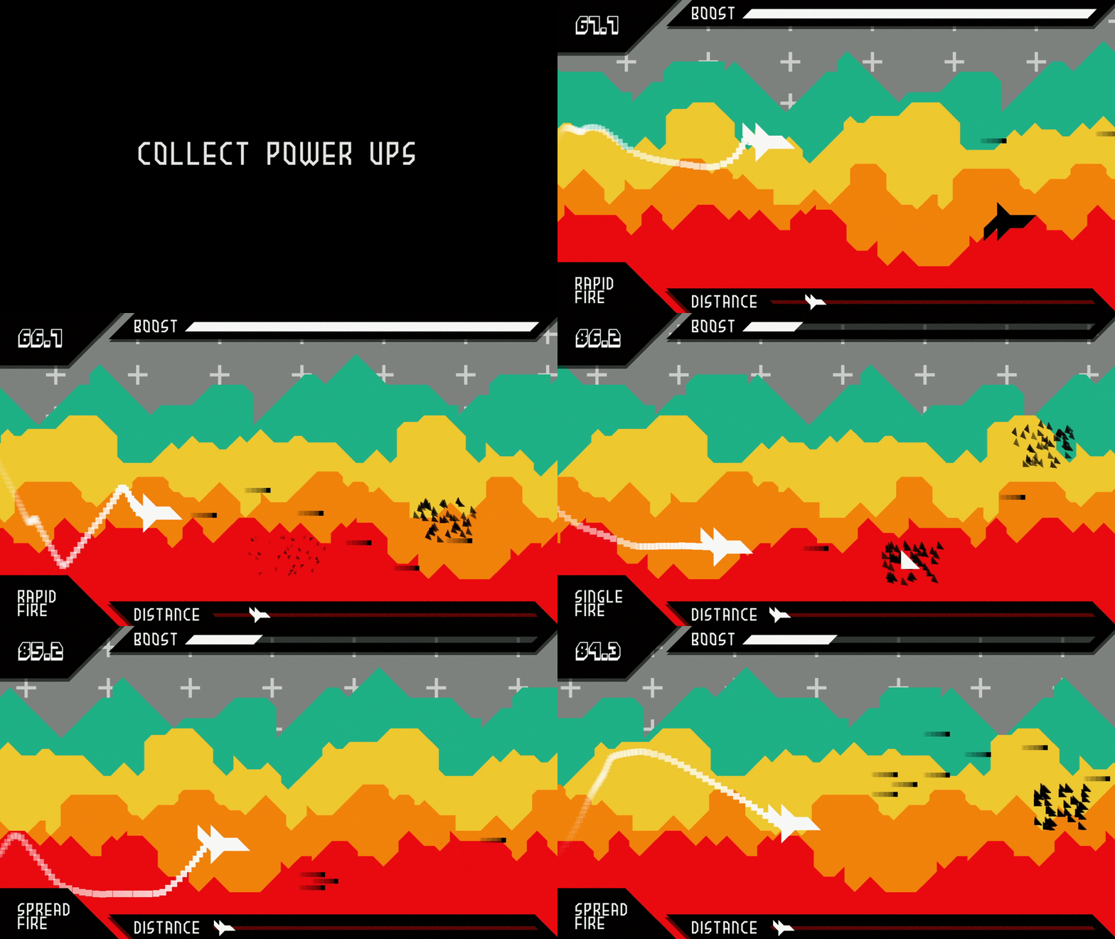
Self Destruct
Self Destruct was the final project of my Graphics 1 class. Using XNA, Self Destruct features scrolling text, parallax backgrounds, a robust particle manager, controller input, and a really cool shader if I do say so myself. The game also features loading from text files and localization between English and Spanish (I knew high school Spanish would one day pay off). My goal was for the game to be as aesthetically coherent as I could make it, lending itself to the 45 degree characteristics from the background to the ships to the particles and the UI.
Shader
When boosting, the entire world gets shaken and split – similarly to how sci-fi movies show ships going through wormholes and such. This was done through a HLSL shader, splitting each pixel into its respective RGB color channels, and then offsetting each value to a nearby pixel, effectively splitting the screen into three layers:
//output struct
struct VertexShaderOutput
{
    //color and coordinate
	float4 Color : COLOR0;
	float2 TextureCoordinate : TEXCOORD0;
};

float4 rumbleRGB(VertexShaderOutput input) : COLOR0
{
    //offset colors based on coordinate and value
	float3 colorR = tex2D(screen, input.TextureCoordinate + r);
	float3 colorG = tex2D(screen, input.TextureCoordinate + g);
	float3 colorB = tex2D(screen, input.TextureCoordinate + b);

	float4 returnColor;
	returnColor.r = colorR.r;
	returnColor.g = colorG.g;
	returnColor.b = colorB.b;
	returnColor.a = 1.0f;
	return returnColor;
}
Particles Galore
There are particles everywhere in this game. When the player explodes, an enemy explodes, the contrail behind the player, even the bullets are particles. With so many sprites possibly on the screen at once, I needed a portable system to keep track of the particles all while allowing them to exhibit their own behavior. Thus, the particle system I created is in effect a manager, with a list of particles and is passed a behavior, which then is owned and updated by the owner of the particles – so each enemy has a separate particle manager for when/if it explodes, and the player has multiple to keep track of each of its systems.
//particle attributes
Sprite mSprite;

//static attributes
Vector2 mPos;
float   mRotation;
float   mScale;
Color   mColor;

//age
int mAgeInMS;

//dynamic attributes
//position
Vector2 mVel;
Vector2 mAcc;
float   mVelDampening;

//rotation
float mRotVel;
float mRotDampening;

//scale
float mScaleVel;
float mScaleAcc;
float mScaleMax;

//tint
Color mInitColor;
Color mFinalColor;
int   mFadeAge;

//end particle attributes


public void Update(GameTime gameTime)
{
    if (mAgeInMS < 0)
       return;

    mAgeInMS -= gameTime.ElapsedGameTime.Milliseconds;

    UpdatePos(gameTime);
    UpdateRotation(gameTime);
    UpdateScale(gameTime);
    UpdateColor(gameTime);
}


.....


//using this particle class, the ship then has a list of particles to simulate the trail
List<Particle> particles = new List<Particle>();

//there is a method to create new particles - this differs based on the effect
void CreateParticle(float posX, float posY);

//as well as an update method for the effect
public void Update(GameTime gameTime, float posX, float posY, bool movingForward, Vector2 lastForward)
{
    effectDurationInMS -= gameTime.ElapsedGameTime.Milliseconds;

    //create new particles
    if (movingForward)
    {
         for (int i = 0; i < newParticleAmount; i++)
         {
            CreateParticle(posX, posY);
         }
    }

    //update all particles - remove dead ones
    for(int i = particles.Count() - 1; i >= 0; i--)
    {
        particles[i].Update(gameTime);

        if(particles[i].IsDead())
        {
           particles.RemoveAt(i);
        }
    }
}
Retrospection and Postmortem
Self Destruct, looking back almost two years later now, is still a really beautiful piece, and I am proud of how cohesive its design is and how it immerses the player when moving. I am proud of the smoothness of the controls, and the gameplay as a whole. Architecturally, it might not be the most concrete game, but that was not its goal. Things like the localization and menu structure could have been better put together, but I feel the gameplay itself is pretty architecturally sound. In terms of depth, the game is more of a tech demo than anything, with there not being much of a win/lose state, and it not being very satisfying either. When actually in gameplay though, the game works well – its the edges that are rough, but when are they ever not?
