Flash Experiments
These ‘Flash Experiments’ were one week exercises in both design and execution. Each week a new prototype was created in a different genre. This process taught me the value of quick iteration coupled with clean execution, and allowed me to become a better designer in the process. The experiments include Rodspin, Blur, Lines, Orbit, and Simple. All of these games have a complete game loop with start, win, and instruction scenes, and can standalone as finished (albeit, small) projects.
Rodspin
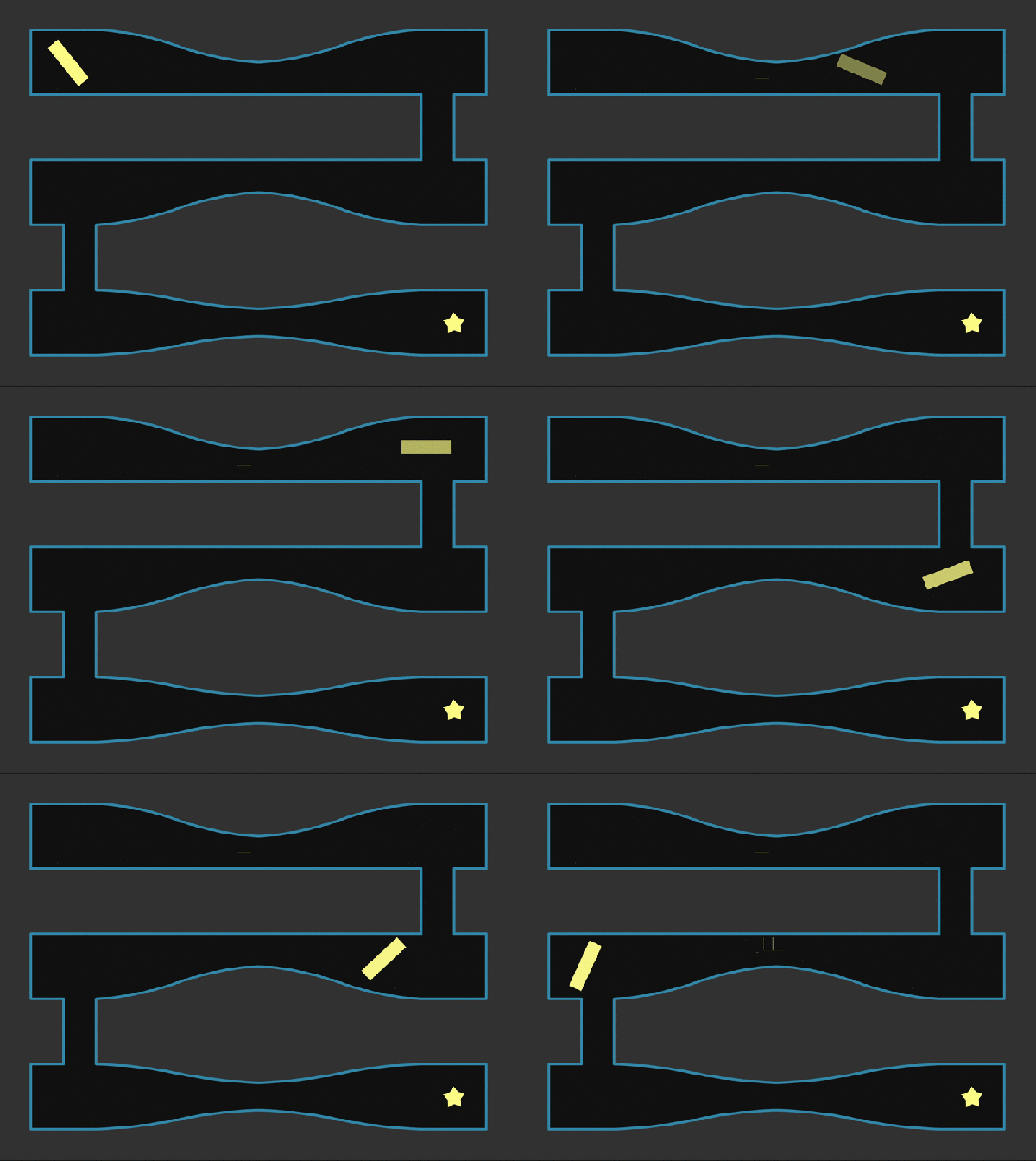 The goal with Rodspin was to create a unique twist on a simple maze game. The player controls a spinning rod (really creative name, huh?), and when it collides with the wall, it slowly fades away. If the rod becomes completely transparent, it’s game over. Depending on the difficulty level chosen, the rod may or may not regenerate ‘health.’ In total, there are 5 levels with 3 levels of difficulty.
Blur
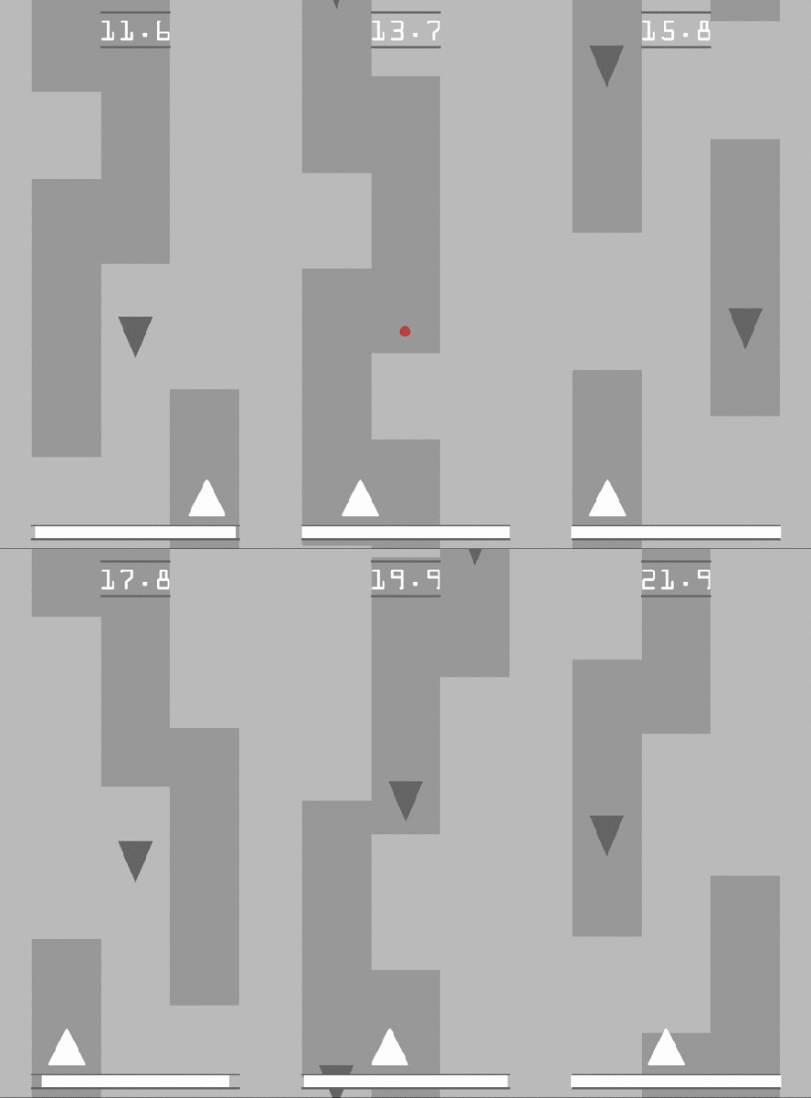 Blur is a vertical shooter with a twist. The player can survive on the dark gray lanes. To move from lane to lane if there is a gap, the player must ‘blur’ and hop between them. Enemies come down from the top, and the player must shoot them, which uses a little of their blur meter. As the player lasts longer and longer, the speed and number of enemies ramp up.
The image to the right does a much better job of defining the gameplay. The backend of the game consists of an object pool for enemies and bullets, as well as a simple procedural content generator for the lane construction that uses a formula to make players use their blur more as they survive longer and longer. The lane collision detection is based on three points within the triangle, checking the color underneath, allowing for some fudging for the players, and theoretically allowing for multiple difficulty levels.
Lines
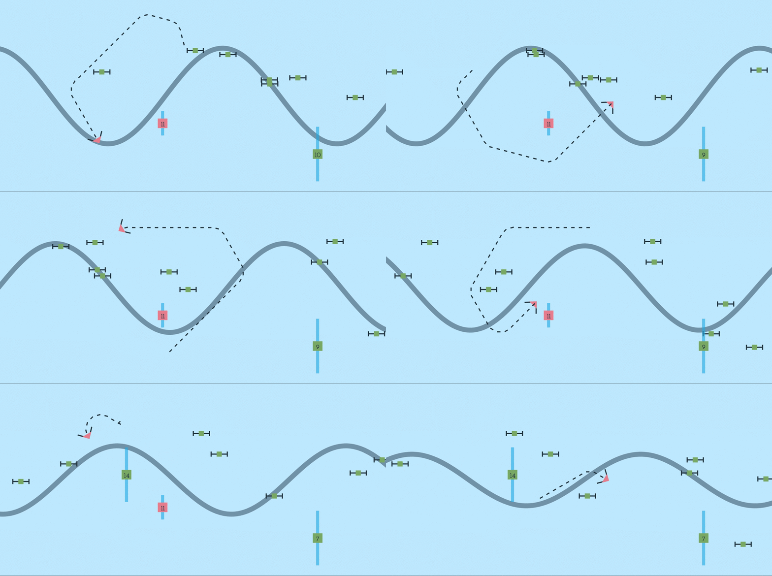
Lines is a little bit more experimental. It is a spin on the side scrolling shooter, but there’s no shooting. The sine wave in the background is the player’s health, and as enemies hit the left side of the screen, its amplitude (and the player’s health) decreases. The player can hit enemies to destroy them, and add to their ‘tail.’ When the player crosses over their tail, they create a barrier, who’s size is determined by how big the overlapped area is. After a while, the barrier depletes and turns red, which the player can then pick up to add back to their health.
Overall, the design is interesting, but is very unbalanced. I think the concept is novel though, and has merit, but the current gameplay doesn’t do it justice. This is a concept I would like to return to.
Orbit
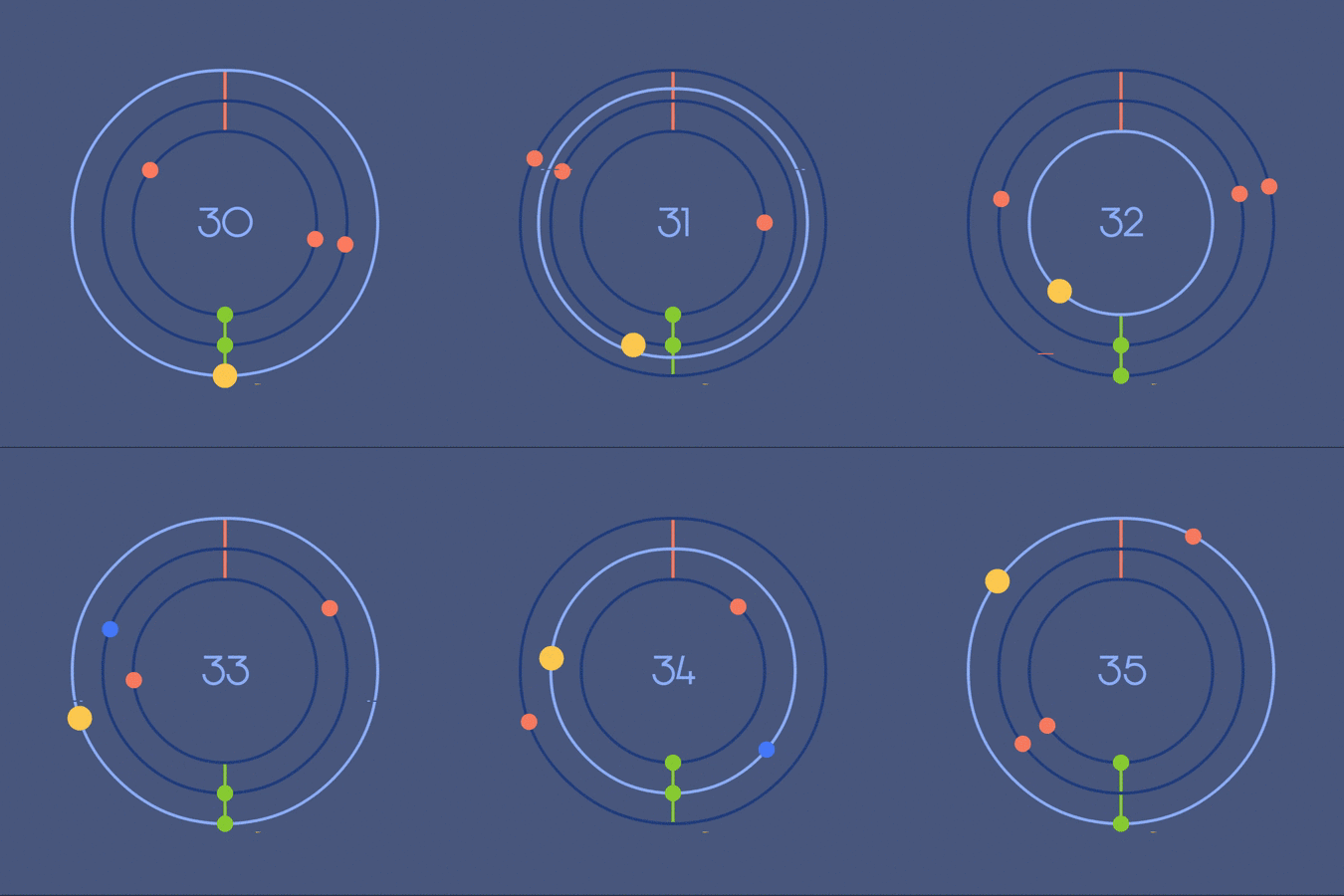 Orbit was created with mobile in mind. There’s two controls: move in a ring and move out a ring, with the goal being to avoid the orbiting red circles. The blue orbs act as health, restoring the player’s lives, but removing five from their score. Each green orb the player collects adds one to their score.
The backend features a procedural difficulty generator, allowing the game to get more and more difficult in spawning waves as the player’s score increases.
Simple
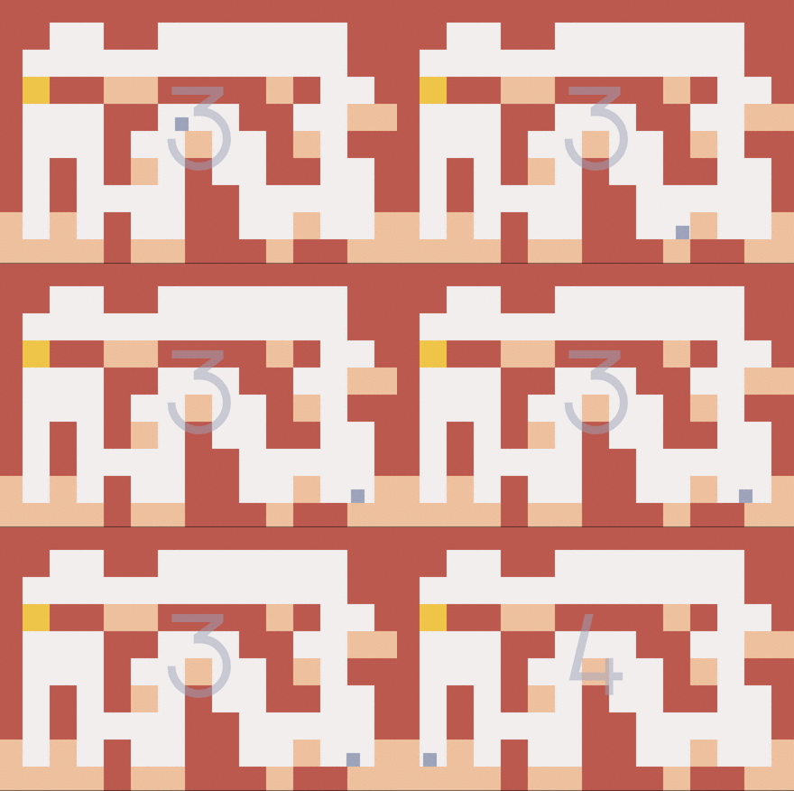 In the vein of Super Meat Boy, Simple is a hard-as-nails platformer – just reach the end, it’s simple! Featuring simple AABB collision detection, Simple contains two levels (as if the first wasn’t hard enough).
I faked simple physics for the player movement, allowing it to be more predictable for the player. The game is hard, but it’s fair.
Retrospection and Postmortem
Looking back, these projects were fun. They were not complicated, but they each had their small challenges, and I really enjoyed designing and iterating on them. Although AS3 is an almost-dead language, others like Haxe and Swift have a similar syntax, so not all is lost. I inadvertently learned the advantages of a node-based scene graph with how I created the architecture for these projects.
The executable in the sidebar to the left contains a .swf for each of these projects.
